Colour

Mid-century modern charm with unexpected twists
No Sense Studio unveils a bold, joyful, and statement-making home that blends mid-century appeal with raw textures, unexpected colours, and statement pieces reflecting the owners’ personality.

How to colour your home like a pro
There are many inspirational ways to add colour to your home beyond slapping on paint. Here are some of our favourite techniques!


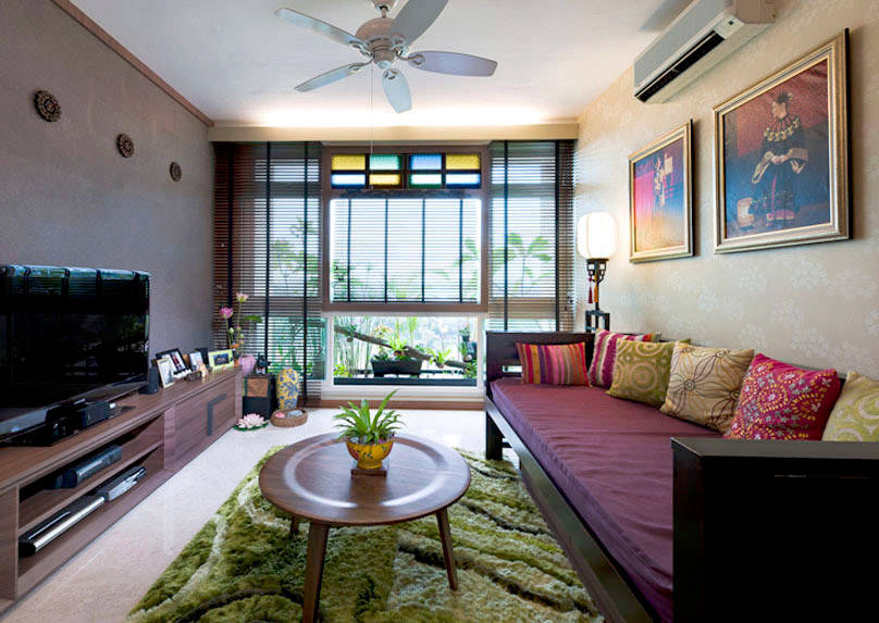
A colourful Tiong Bahru apartment with retro and mid-century vibes
This 1940s walk-up apartment fuses quirky design, mid-century vibes, and historical charm into a lively and functional home filled with personality.

Joyful Sophistication: Enter a vibrant world of colour with Lamitak
Dopamine Decor meets Barbiecore to bring home a positive state of mind in this latest edition to the Lamitak series – ‘Design is a Way of Life’.


Colour fancy
Sparked by the homeowners’ love of colours, funky shades and art come on strong in this truly characterful resale flat designed by Insight.Out Studio.

Playing with the unconventional
This colourful flat by Tofu Studio challenges the limits of HDB living with a convention-defying design that’s simply brilliant.


Watch: This one-of-a-kind flat is like a colourful art gallery
The unusual combination of materials and colours as well as striking furniture pieces in this three-room flat creates a visually captivating interior that’s truly unexpected. Take a look inside!

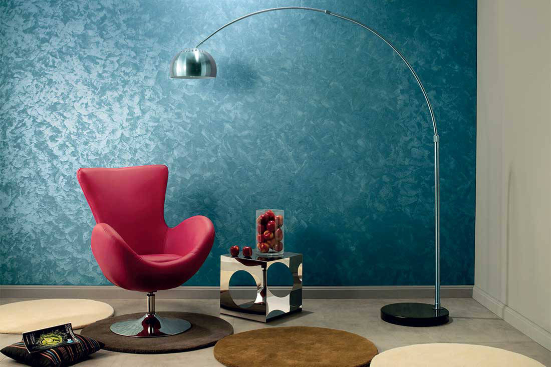
5 creative ways to colour your home
More and more, people are embracing colour in their home. Beyond the standard paint job, there are many other creative and impactful ways to add different shades to your home. Here are five examples we love.


Neuroscience and what it means for Interior Design
Nikki Hunt, Principal of Design Intervention tells us why neuroscience is a most exciting topic for discussion and how she integrates it into her interior projects.

5 ways to improve your well-being at home
From clutter-proofing to light therapy to materials, wellness design trends are here to stay and make the home a healthier and happier place.


Colourful home with a mid-century modern touch
A married couple’s love for mid-century modern design and retro style is reflected in this colourful home.

A journey through colour
For his own home, Cheung Yu Ting of Local Architecture Research + Design has used colour as a tool to craft a living experience that’s one of a kind.


Colour and rose-tinted views in a BTO flat
A couple working in the creative industry and their two dogs live in this colourful three-room flat that reflects their sunny disposition.

Making a bold statement
With its dashing display of colours, shapes and metropolitan style, this bachelor pad is a true head-turner.


Colour forecast 2022: Shades we’ll be seeing in the coming year
According to Dulux, colours that embody authenticity, empowerment and hope will shape our interiors in the coming year.

Life revolves around the kitchen in this two-bedder apartment
Rather than being tucked away, this warm and cheery kitchen is the pride of the home and made for cooking, living and connecting.


This cat-friendly home is vibrant, playful and purr-fectly pleasing
Linear Space Concepts used a combination of custom-carpentry, designer furniture and a myriad of colours, patterns and textures to give this apartment its playful charm.

10 easy ways to inject colour into a space without renovating
Tired of your uninspiring interior? Perhaps a splash of colour is all you need. These foolproof methods are guaranteed to revitalise your home.


The effective use of bold colours and patterns to inject a fun vibe in this flat
Bold colours and funky patterns give this home a vibrant and youthful feel, and perfectly reflect the owners’ personalities.

Eclectic apartment living for a well-travelled family
This eclectic apartment is a colourful melange of design elements, with generous and comfortable spaces for family living.


A colourful condo that’s clutter-free
This resale condominium unit receives a bright, unconventional makeover from Forefront Interior’s Joey Pear, where each room features a different colour scheme.

6 impactful ways to bring pattern into your home
Here are six ways to add drama and colour to your home and life.


Characterful flat dressed in bold colours and textures
What makes this resale flat stand out from the rest is the wonderful mix of industrial, vintage style influences and colour. The Poetus design team also went beyond the usual custom details by repurposing old vintage accents into charming embellishments for the cabinetry.

Walking Into Colour With Hermès
During Milan Design Week, Hermès presented its colourful Collections for the Home 2018-2019 in an immersive, intimate and dreamlike setting where colour was an element to be inhabited.

Colour inspiration! 3 ways to add mauve-meets-blush to your home
Create a welcoming, cocooning home with the AkzoNobel Colour of the Year 2018 – Heart Wood. This soft, gentle shade is a particularly great complement to a natural or woody material palette.

Colour inspiration! 3 products in teal to brighten your home
From Nippon Paint’s Trend Beyond Colours 2018 range, this invigorating teal hue communicates a sense of adventure and exploration. Layer it on with other intriguing shades from the same blue-green colour family, such as turquoise and marine blue, for a dynamic ombre theme.

Colour inspiration! 3 products in ultra violet that will look great in your home
The Pantone Color of the Year 2018 is a “dramatically provocative shade”, as put by the leading colour authority Pantone Color Institute. Use this colour to enliven a space or create a sassy and stylish look.
How one paint company gives you more time for YOU
Not just a producer of high quality paint products, Nippon Paint also has services designed to ease the painting process so you have more time to do the things you love.


Bold colour, fun forms and striking patterns in this modern Melbourne home
The design of this two-storey house, located in Melbourne, enlists colour, movement and fun, for a cheerful abode for a couple.

Would you brighten your home with turquoise and yellow?
Tired of white? This HDB flat by Linear Space Concepts shows how you can use cheery colours to give life to your own home.


Colourful Scandi-style DBSS flat by D’ Initial Concept
Everything looks better with a touch of colour and this couldn’t be truer for this DBSS flat where D’ Initial Concept linked colourful palettes with a simple Scandinavian-styled backdrop

4-room HDB in pretty pastels by D’ Initial Concept
Forget white and try on pretty pastels in your home for a similar effect