Sync Interior introduced a new space configuration and modern conveniences to this 40-year-old walk-up apartment, while preserving some of its original and most charming features.
1 October 2023

Text by Disa Tan
Project type: 3-bedroom walk-up apartment
Floor area: 1,800sqft
Interior consultants Terence Chia and Eric Chua from Sync Interior saw potential in the neglected interiors of this decades-old apartment. They reconfigured the kitchen into two zones: one wet and one dry. The latter has free-flowing access to the dining area, and features an interesting wall installation of honeycomb tiles with an unfinished arrangement as a decorative backsplash.

The homeowners, a married couple, found a trunk wood tabletop that they wanted to incorporate into their open communal space. With one end mounted on the wall, the slim and characterful table is tastefully repurposed as a bar counter. It overlooks a row of windows with hidden storage underneath as the team did not want to waste the functional space beneath.

One of the original architectural elements that drew the homeowners to purchase this apartment was the staircase and its distressed-looking support beam. Terence and Eric preserved both elements and added louvred cabinet doors in white for the stairwell storage.
Although the staircase could be retained, the deteriorating state of the existing parquet flooring made it impossible for the team to save it. They overlaid the floors with vinyl for an updated style that still fits in with the weathered staircase.
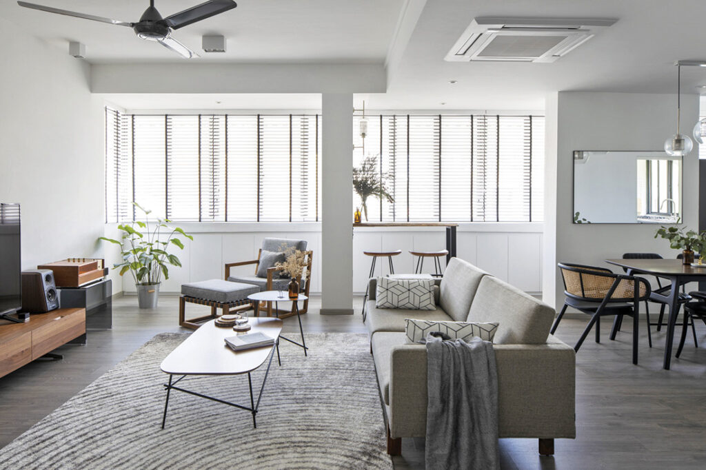
Citing the relaxed open-living layout of the communal zones as the highlight of the home, Terence says: “This open and spacious concept connects the living, dining and dry kitchen as one.” With this breezy layout, the pleasing circulation of space is accentuated by the choice of low-lying furniture that promise lounge-worthy days ahead.
To counter the odd configuration of the bathroom, the team worked in custom-built carpentry works to better regularise the layout. It now has tall cabinetry to conceal unsightly piping and a sleek colour palette of cool neutrals that erases all traces of its previous flaws.
Much like the free- flowing expanse of space in the communal areas, the study has a bright and airy atmosphere conducive for work-from-home duties. Natural light pours in from the balcony and with a restrained approach to colour, this multipurpose space feels much more expansive.

Terence reveals that the homeowners were not intending to spend a lot of their waking hours in the master bedroom, so they wanted to keep the style simple and utilitarian. The team had the main wall painted in half-wall treatment of grey to anchor the headboard. They then worked in a minimalistic-looking base of other neutral tones and streamlined details for a picture of calm.
Sync Interior
www.syncinterior.com
www.facebook.com/Syncinterior
www.instagram.com/syncinterior
Featured in Lookbox Annual 2023
Like what you just read? Similar articles below

Vote and win! Launching 13 May, pick your favourite home from 31 shortlisted projects featured in Lookbox Annual 2025 and stand to win great prizes from BoConcept, Bolia, CULT Design, Prelude Living and XTRA.

Having lived in France for some time, the owners of this HDB maisonette desired to bring some of the French art de vivre into their new home.