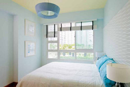
Simple ways to introduce pastel colours into your home.
Pretty pastels are making a comeback. Carrie Chen from Nippon Paint lets us in on some easy ways to bring the colours into the home.
In the Lamitak series ‘Home, Seen Differently’, discover how the unhurried ease of café culture can inspire the way we live.
AALTO’s latest FLO pedestal basin and NATALY basin mixer show how compact bathrooms can gain presence through thoughtful form, finish and proportion.
Designing for pets begins with how they move, rest and live alongside us. In Singapore homes, the most thoughtful solutions are often practical and beautifully woven into daily life.
The Italian furniture house known for its obsessive approach to materials and comfort has opened a by-appointment space with Rosso Italia Living. We went to find out what sets it apart.
Your parents’ home should keep them safe – but it shouldn’t have to look like it’s trying to. Here’s how to make smart, design-conscious upgrades that work for the whole family.
In Mo Ran · 墨染, a two-bedroom apartment styled by ButterHomes, Haley Tey shows how Chinese-inspired interiors can feel current and quietly layered — without relying on obvious motifs or heavy ornament.
Tips & Tricks to Bring Pastel Colours Into Your Home