In this house, the restraint in palette allows for a gracious – almost meditative – space, showing how attention to the interaction of tone, texture and forms can create simply stylish interiors.
27 November 2017


Text by Ella McDougall
Photography by Peter Bennetts
A muted palette does not equate to an uninspired space – the Theresa St Residence in Victoria is a gorgeous example of this. Here, light, tone and form are the focus and add their own element of interest, without disturbing the restful spirit of the house.
Previously, the space was far less elegant. An unnecessarily wide hallway barrelled through to the living room, forcing other living spaces to the periphery. Bathrooms and mezzanine levels felt closed in.
Sonelo Design Studio were called in to reconsider the space and create flow in what was a disjointed and confused home. Sonelo’s renovation worked to a very modest budget – but this limited surplus of funds ultimately inspired the simple but effective alterations that capitalise on naturally occurring elements such as light and texture.
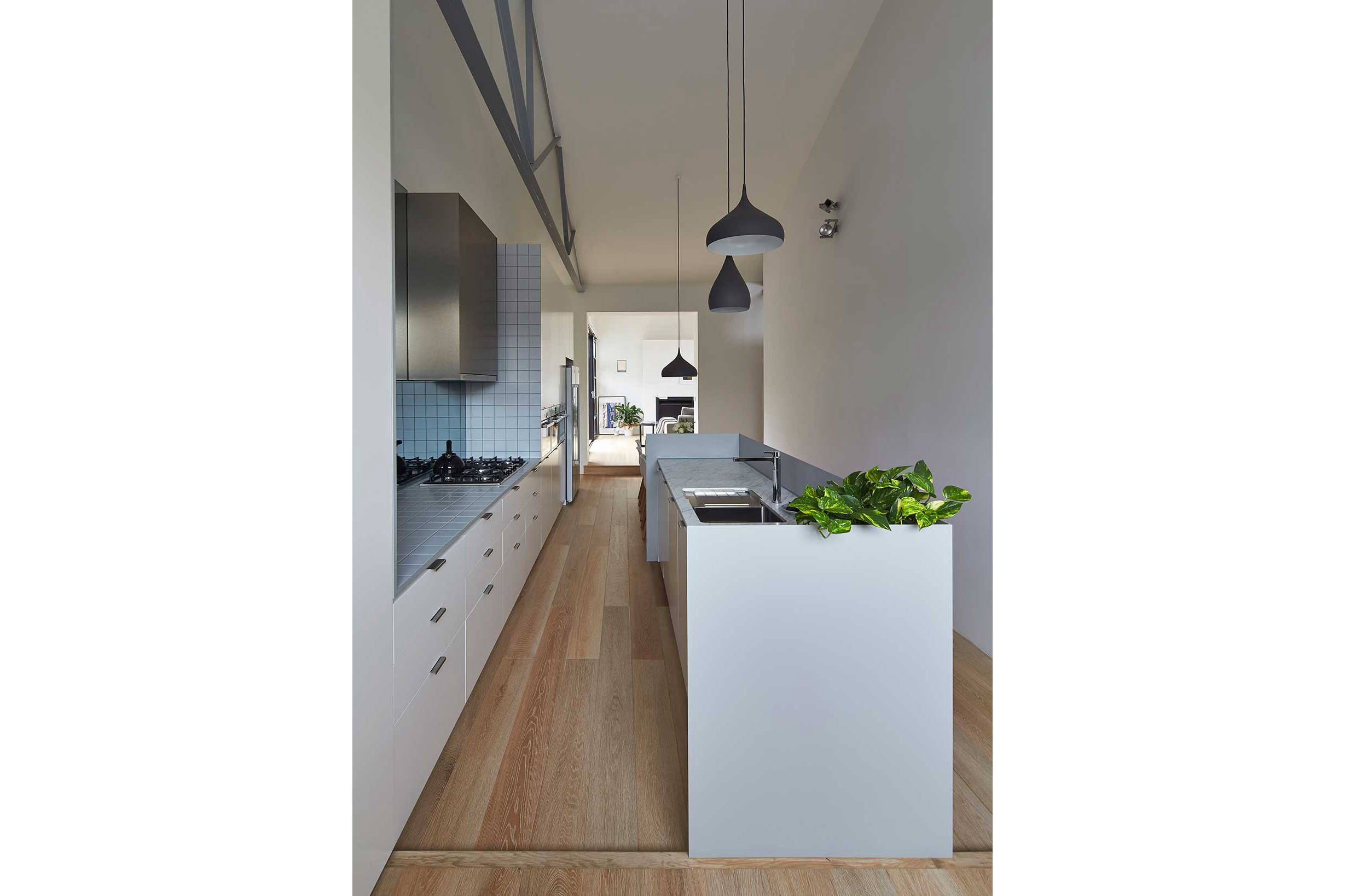
Firstly, the task was to reallocate spaces. The kitchen, dining and bathroom spaces were moved into the centre of the home, which was previously reserved for the mammoth and underused hallway.
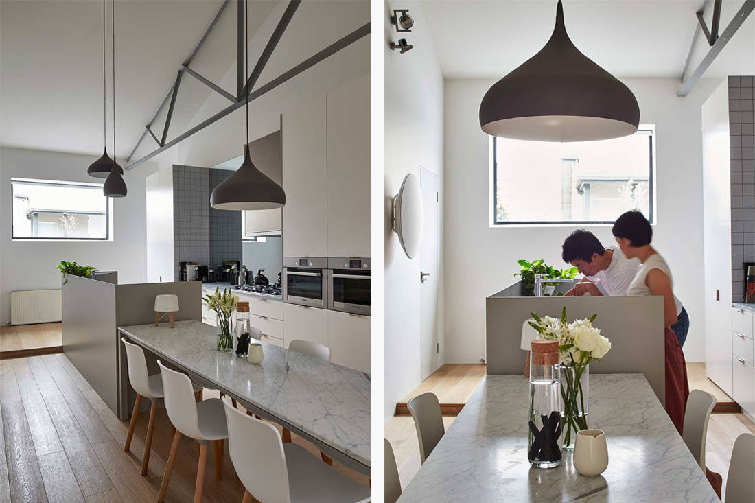
Although the narrow dimensions of the house risk to make the house feel limited, Sonelo’s attention to continuous form exudes a sense of spaciousness. Within the kitchen, this is evident in a seamless tying together of the island and dining table. Both pieces extend across and exaggerate the length of the kitchen, offering a subtle sense of grandeur in a neat space. The unity of these help to segment the kitchen and give a sense of order, marking which is the place for cooking and which is not.

Similarly, in the bathroom the mixed use of materials – tiles are cut off mid wall to be met with white painted timber panels – allows for the design to visually dissect the space and guide one’s eye. The line that traces the join of these materials extends also onto the mirror and into the off ceiling height of the shower. When in a bathroom that is illuminated by a gaping skylight, the shift to further enclose the shower allows for a welcome sense of privacy and protection. Beyond, the vertical white timber panels and corresponding white fixtures bounce and enhance the airiness of the bathroom.
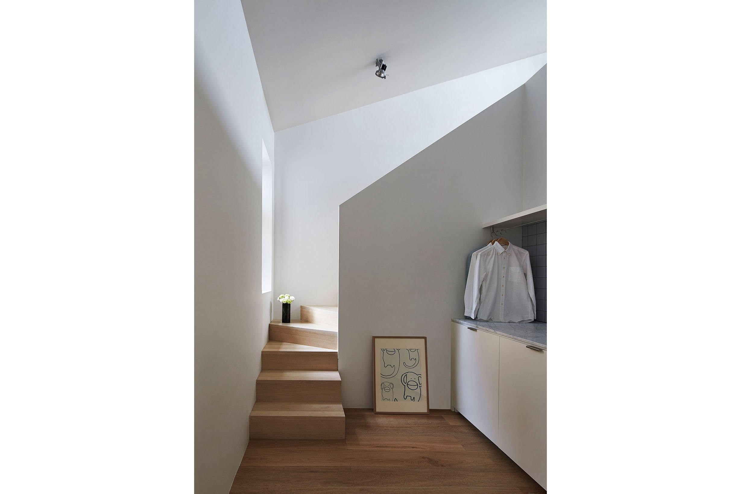
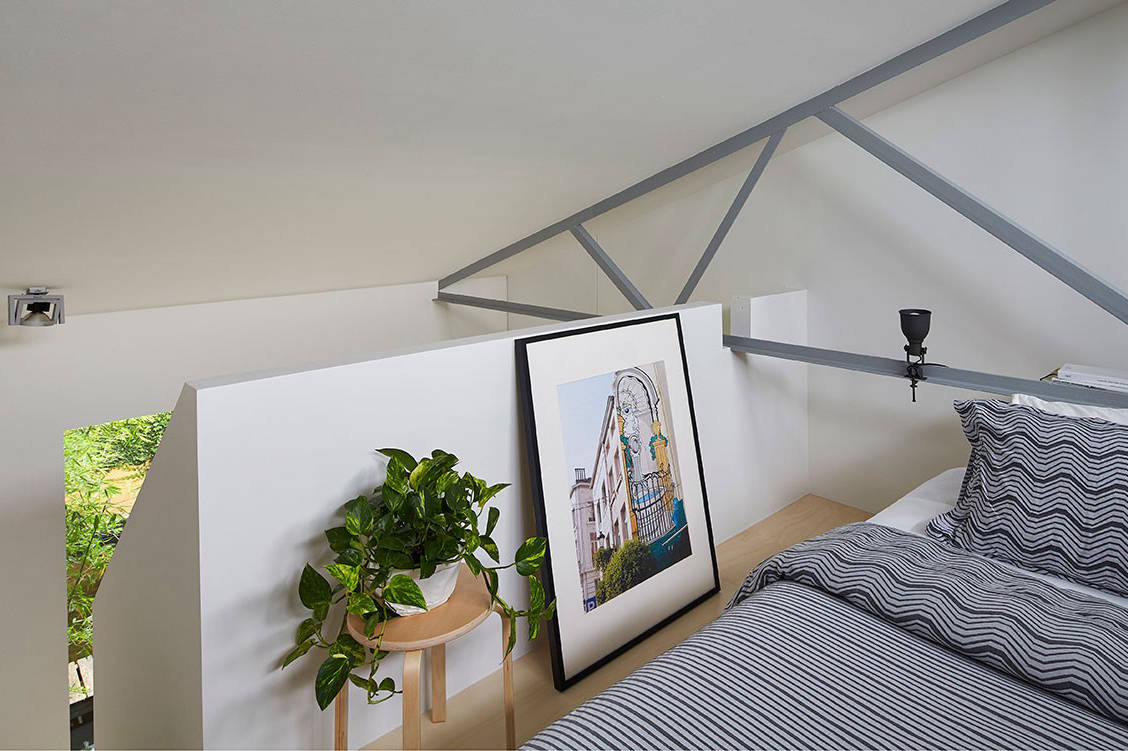
The stairways have also been transformed from utilitarian structure to an impressive – and simple – geometric feature. Each has been covered in a solid timber frontage, simultaneously hiding the tangle of steps while carving graphic shapes onto, and out from, the behind wall. The obtuse angulation of each casts moody shadows, playing with light direction and tone for a dramatic effect.
The material and colour palette is decidedly calming. Soft, cool timbers climb from the floor up through the staircases. While colour is used sparingly – such as the soft marine square tiles in the bathroom and the same in baby blue within the kitchen – it acts only to warm and cool the broader neutral tones. Marble is also used on the dining table, where the ripple of veining dark hues add interest while adhering to the organic and relaxed appeal of the house.
More information at Sonelo Design Studio.
Like what you just read? Similar articles below

Taking its cue from ‘Dynamic Minimalism,’ this four-bedroom apartment in District 9 beautifully captures the concept of simplicity as well as movement and energy within its stylish interiors.

The family living here enjoys the outdoors via a miniature Japanese garden and green pockets on every floor.