Three condo apartments underwent complete transformations that turned them into modern structural beauties

You may be familiar with that feeling: that excitement of finally receiving the keys to your new home! You probably have grand plans and ideas to renovate your new place and turn it into the dream home you’ve always wanted. The homeowners of these three condominium apartments stand out in particular. With the help of interior/architecture firms, they went all out to completely transform their homes into amazingly unrecognisable urban pads.
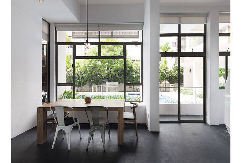
While storage is usually stowed away in most homes, designer William Chan of Space Edge bucks the trend and places storage front and centre in the design of this apartment at The Centris.
The apartment originally came with a full spectrum of programmes (living and dining areas, wet and dry kitchens, three bedrooms, two bathrooms, a maid’s room and a balcony). William decluttered the original layout by setting a storage unit, referred to as Centrepieces, where the dry kitchen previously stood.
An all-in-one storage unit, the Centrepiece is a striking wooden sculpture that also accommodates a dining table that can be pivoted out when required. It also extends to the back of the apartment and efficiently defines two corridors: one to the kitchen and another to the bedroom.
The other spaces have also been adapted to the homeowners’ needs. For example, the master bedroom has been afforded more space by moving wardrobes into an adjacent walk0in-wardrobe-cum-study area. The latter space is lined with flushed wardrobe panels in bright cobalt blue, an anchoring colour in the home.
When work needs to be done, one of the wardrobe doors opens up to reveal a modest study unit.
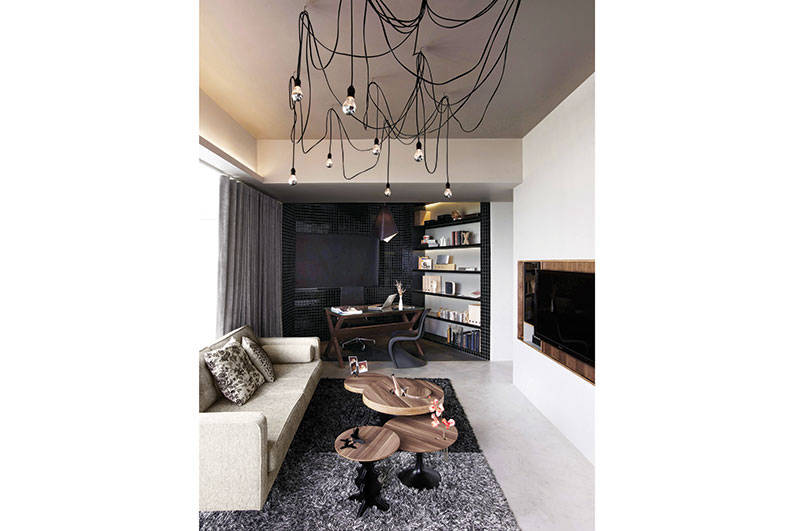
There is perhaps nothing more enticing for a bachelor than to have his very own pad – hidden corners, transforming pods and all included. This is certainly what the owner of this studio apartment got when designer Adrian Lai of META reworked his home.
Adrian first removed the original mezzanine level of the home because it lowered a portion of the ceiling and made the home feel tight and closed in. But once the apartment was gutted, the designer noticed structures and service ducts that cut into parts of the 4.2m-high volume. Instead of fighting it, he adeptly harnessed these protrusions to create what he calls the “Object” – a multi-functional, white, pod-like structure in the middle of the space.
Various spaces are planned around the Object: the walk-in wardrobe is housed within it, as is the guest bedroom-cum study while the owner’s bedroom sits simply atop the Object. The staircase to the private perch can be conveniently stowed away within the glossy white pod as well.
Adrian likens the irregular facets and niches of the Object to the cave villas in Santorini, Greece. It is an apt reference given that the apartment rests just beside the common pool, much like a poolside cabana.
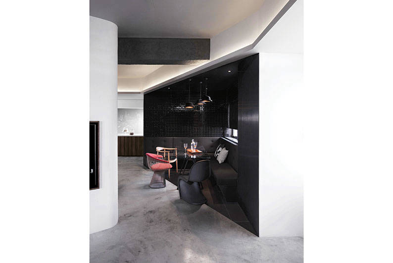
As far as renovation projects go, the redesign of this apartment at Bayshore Park Condominium for a young couple was downright herculean! It wasn’t just about skin-deep alterations to how the apartment looked; it was about upending the very core make-up of the apartment to create an open, fluid home with its fair share of private moments.
The original apartment was an awkward puzzle of oddly angled spaces – not the most ideal shell for a home, as designer Matthew Lai of Studio XMSL says. He shares that the easiest way to deal with it was to “hack away all the walls and start over”.
Once all the non-structural were removed, Matthew reconfigured the house into a series of spaces that loop themselves around a central core made up of a storeroom and walk-in wardrobe. Around this core, one space extends into the next, and then the next, in a continuous “corridor of spaces”.
Underlining the flow of spaces, Matthew was very careful with how he detailed the spaces. In contrast to the abrupt angles of the original layout, he rounded off any corners facing the corridor to emphasise the fluidity of space, as de gentle curvature in the false ceiling.
Given the continuous thread of spaces, it was important to clearly demarcate one space from the next. For this, spaces like the dining area and study area are appointed in sophisticated black as a contrast to lighter adjacent spaces.