Selecting a colour scheme for interior rooms is one of the most creative parts of interior design. It is the bedrock upon which many other pillars of interior decoration rest. Here are a few of many options and approaches to creating a colour palette.
4 May 2022
Colour has actually been proven to have psychological and physical effects on the viewer – especially over prolonged periods of time. Naturally, this makes room colour ideas one of the most important design elements in your home. Selecting the right colours for your personality, habits and lifestyle can be extremely beneficial to your health and mental faculties.
Studies have proven that colour can impact an individual’s mood, productivity, creativity, heart rate and even stress levels. Taking advantage of the science behind colour can therefore help you optimize your home and cultivate the perfect environment for healthy living. However, it also means that choosing the wrong room colours can have a significantly negative effect.
Painting a room with all white walls is a fairly standard practice – but it is actually one of the most harmful colour choices that an individual can make. This is because all-white environments have a sterile appearance which has led subjects in just about every colour study to report decreased productivity levels. An all-white room is restrictive and clinical, which can negatively impact an individual’s mood and will almost definitely stifle creativity.
This does not mean that rooms should never be painted white. White has certainly earned a place in most modern colour schemes – but as a general rule, it should be contrasted with more stimulating colours to keep the mind engaged with the visual environment. Bold colours like blue and red work extremely well with white.
Blue is a particularly good choice as it is also a cool tone which can blend well with white. For those who want a more neutral colour scheme without the negative effects of all-white walls, lighter shades of blue and green can be used in conjunction with white to keep the environment visually interesting.

However, bold colours are becoming more popular in contemporary HDB colour schemes. When considering introducing a solid colour into your interior – especially as a feature wall – you personal preferences should be a point of consultation prior to making the choice. Most colours can be tied to specific psychological effects, so you will want to consider all of these and select the colour that will be the most beneficial for your specific lifestyle.
For example; blue is the colour of creativity. It promotes calmness, tranquility and inner peace. The deep, subdued tones of a blue room or wall are likely to sooth the mind in preparation for new creative ideas to blossom. By contrast, red is a very stimulating colour which can even raise the heartrate. Red colour themes can help to improve focus and performance in detail-oriented tasks. Green promotes harmony, empathy and inspiration. Yellow is another powerful colour which can stimulate creativity and is often linked to happiness.
A good strategy to test what kind of colour benefits will most improve your daily life is to surround yourself with accents of that particular colour over a period of time. This is a way to analyze the effect that each colour might have on you before you take the plunge of actually painting. You may be surprised by the results!

Wall colour combination room painting ideas: the five best room painting colours and combo colours to paint rooms
1. Green and brown

Green and brown are both very earthy, natural colours which complement each other nicely. Green inspires creativity while brown helps to keep the colour scheme grounded, promoting a mix of practicality and productivity.

Match lighter shades of green with light shades of brown, and dark greens with dark browns for a uniform effect. This will create a natural and calming interior perfectly suited for a study room or bedroom.

2. Burgundy and Pink

Burgundy and pink is a bold choice which will inspire productivity and stimulation. For focus, drama and intrigue, this colour combination is without a doubt one of the best home painting ideas. This is not the best two colour combination for bedrooms as it is very stimulating and could distract you from trying to sleep.
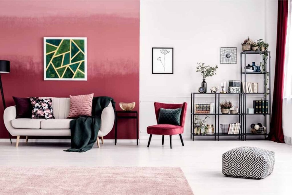
However, this layered and exciting combination works very well in areas where energy is most needed, such as a study room or a living room. These are slightly less common colours for wall painting, but you should still be able to purchase them at supply stores or from professionals such as Nippon Paint.

3. Blue and grey

Logically, the best colour for bedrooms should be grey. Grey absorbs much more light than its main competitor (white), making it an ideal choice for the one room in the house where darkness can be crucial for sleep. However, grey bedrooms – much like white – can feel uninspiring stifle creativity.

One of the best ways to combat this is to lean into a firm colour scheme that will provide the advantages of grey walls without looking like a cinderblock. Blue is the perfect candidate for this combination as it tones well with the coolness of a grey wall, yet manages to add the much needed depth and warmth to keep the room visually interesting.

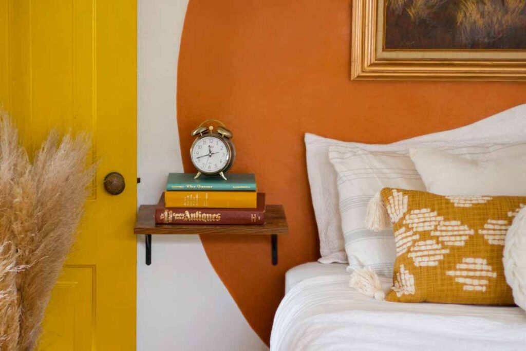
4. Orange and pink

Orange and pink are both vibrant colours which encourage fun, happiness and a carefree lifestyle. They are some of the most prominent colours associated with childhood and as such have a certain playfulness about them.

Because they are both such strong colours, one of the best ways to style them together is to take very light shades or contrast one dark and one light shade (rather than two bold hues, which could become overwhelming). Orange also works very well when thrown into this mix, creating an earthy and warm vibe sure to inspire happiness.
5. Dark blue and white

Dark blue looks even deeper and more mysterious when contrasted with a crisp white. This colour scheme makes blue stand out and will create an artistic, moody and creative effect.

It is best suited to living rooms and workspaces for creative types. For more ideas on how to style dark blue, see here.

Like what you just read? Similar articles below

Discover how these long-awaited collections from Silestone® by Cosentino bring real glamour, character and greater durability to your home.

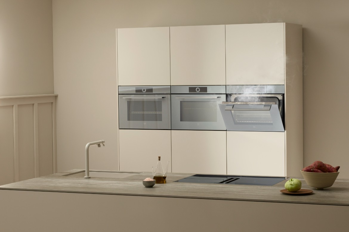
In this handsome and monochrome BTO flat, cooking and meals are done on a ‘floating’ island platform.